Deswik
UI/UX Designer
During my time at Deswik as UI/UX designer, I worked across multiple products in their enterprise suite of tools. I was responsible for trying to help make the products look more consistent with one another, less dated, and to improve the workflows. While images can't easily illustrate the improvements to the workflow (which was my day-to-day work), hopefully these help illustrate the general improvements made across the product.
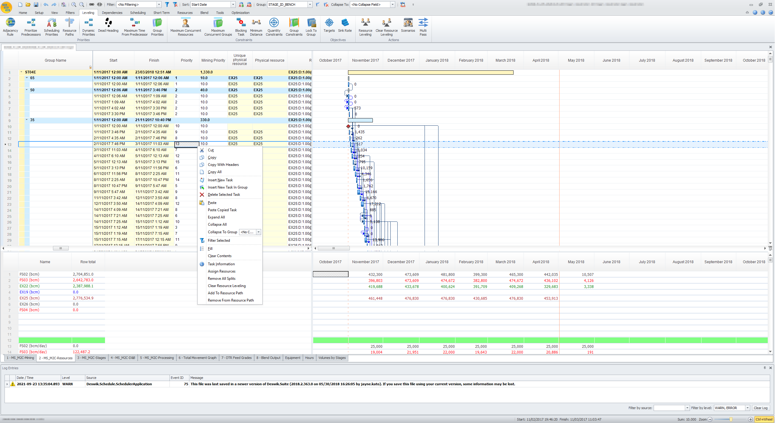
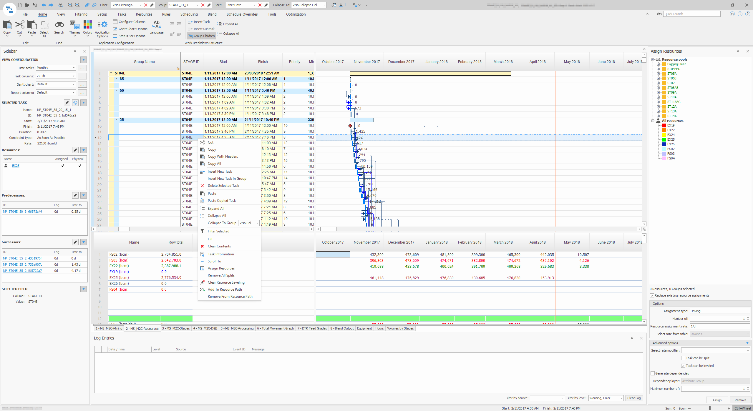
In the before and after images below for the main gantt chart view of the Scheduler product, the following issues were addressed:
- The iconography had been randomly selected - all icons were redesigned
- Finding additional information about each row item was slow - a customisable side bar was added
- It was hard to find the desired tools - ribbons were redesigned, allowing customisation, and a quick launch search bar was added
- The gantt bars were dated looking and poorly drawn - options which added complexity to rendering were removed and a flat visual styling was adopted
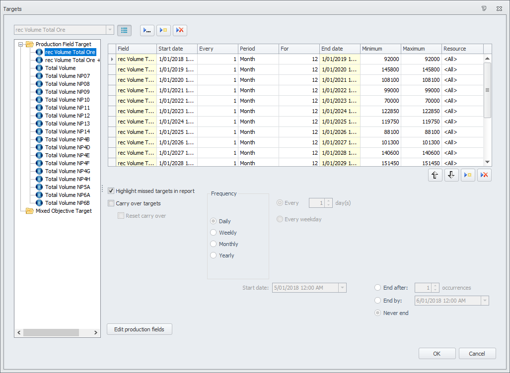
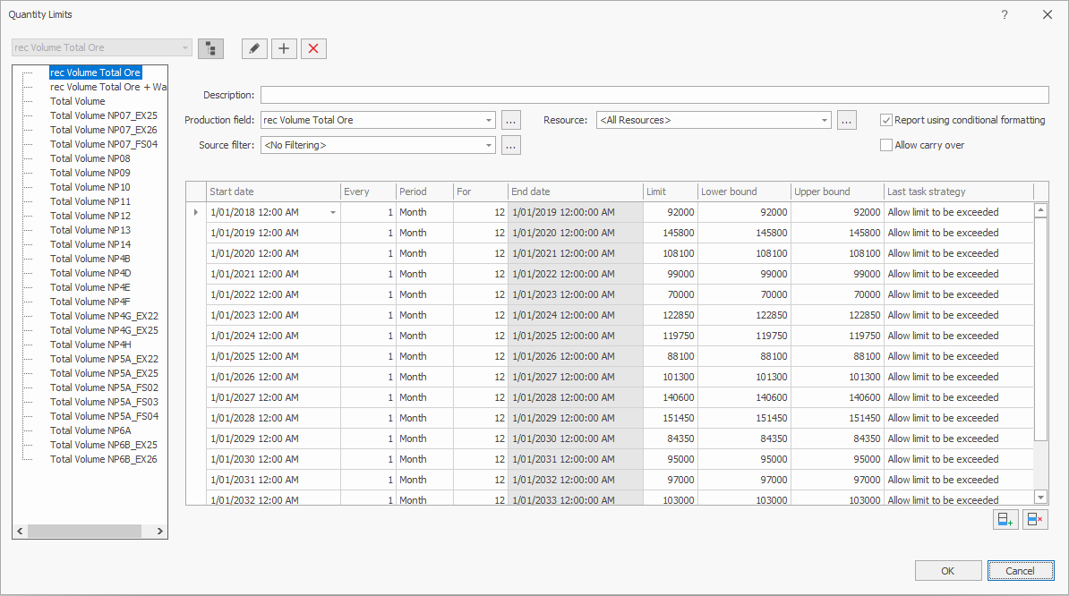
The Targets window, used for setting constraints on quantities modelled per period, had the following issues addressed:
- The terminology used was confusing - the workflow was analysed and redesigned as a constraint/limit as the term "target" was not an accurate representation of the function
- The yellow to represent read only was confusing for new users - this was returned to a more traditional grey
- The layout was messy - unused fields were removed, layout was cleaned up
- The separate wizard popup for creating new constraints was completely removed and in-place creation was added
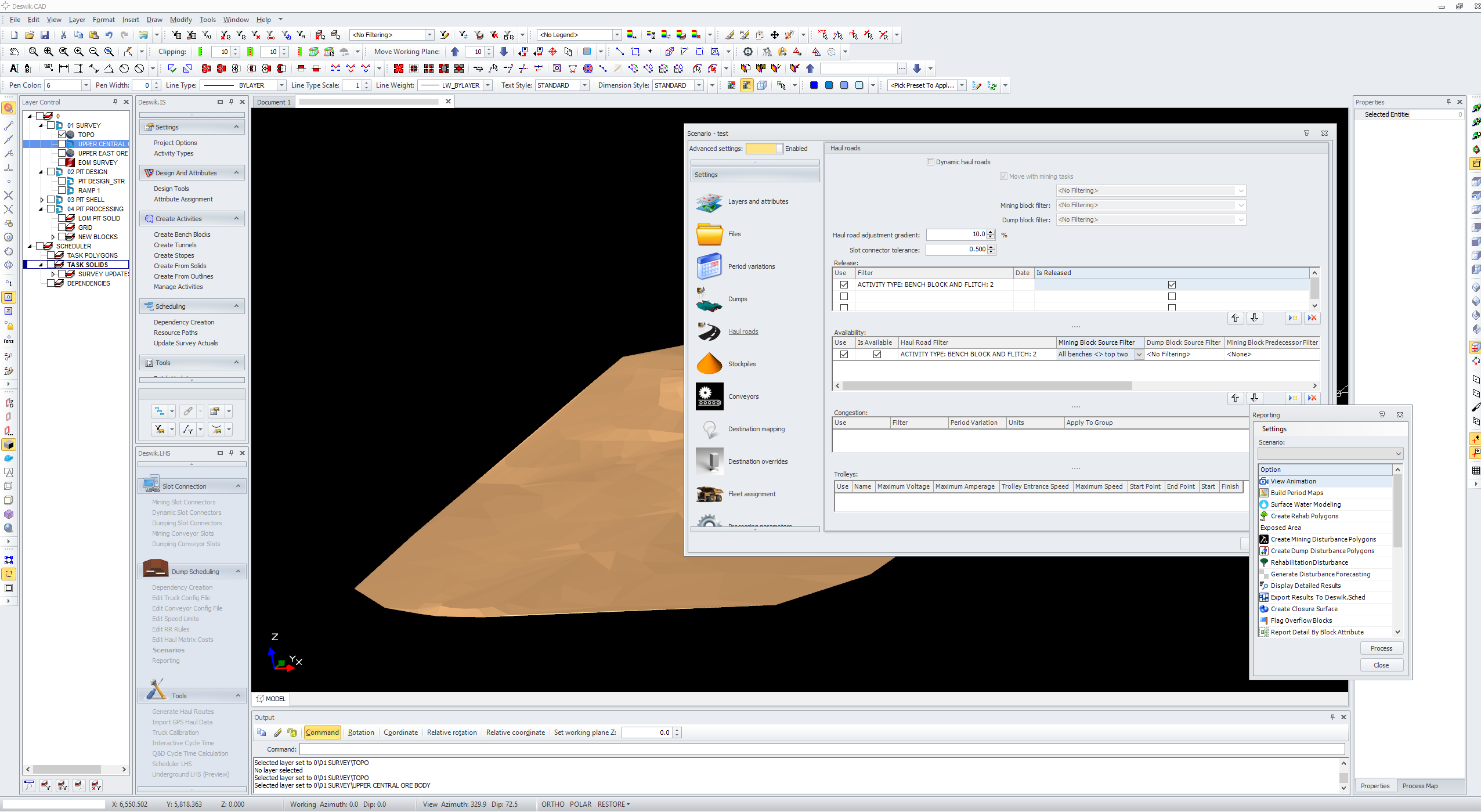
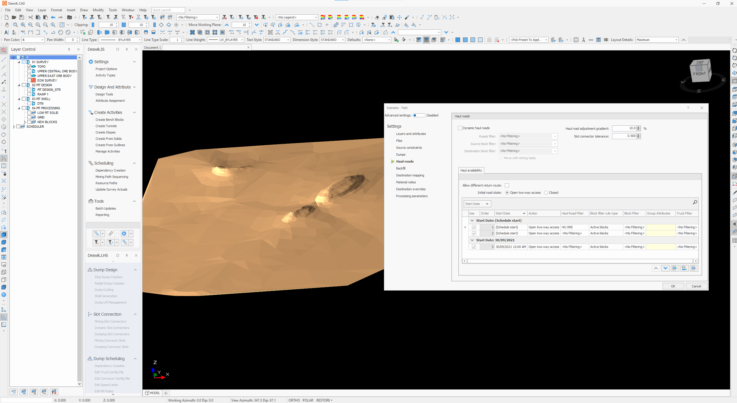
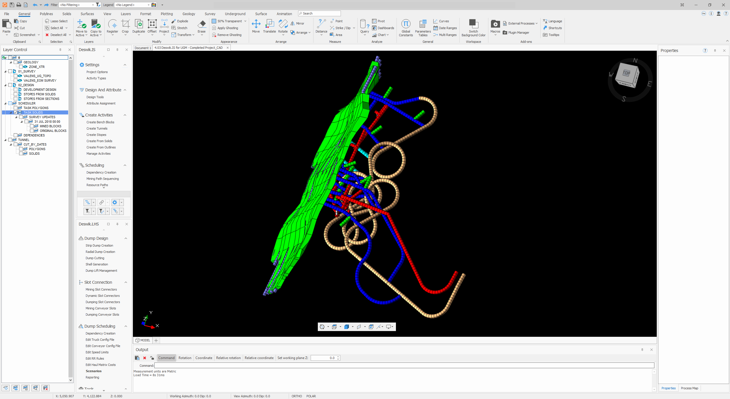
Within the CAD product, used for 3D modelling of the material to be mined and road network, I contributed by:
- Redesigning all the iconography to use a consistent visual style, colour palette, and visual themes
- Improvements to workflows in the landform and haulage product (LHS)
- Created all iconography for use in the new backstage area of the product
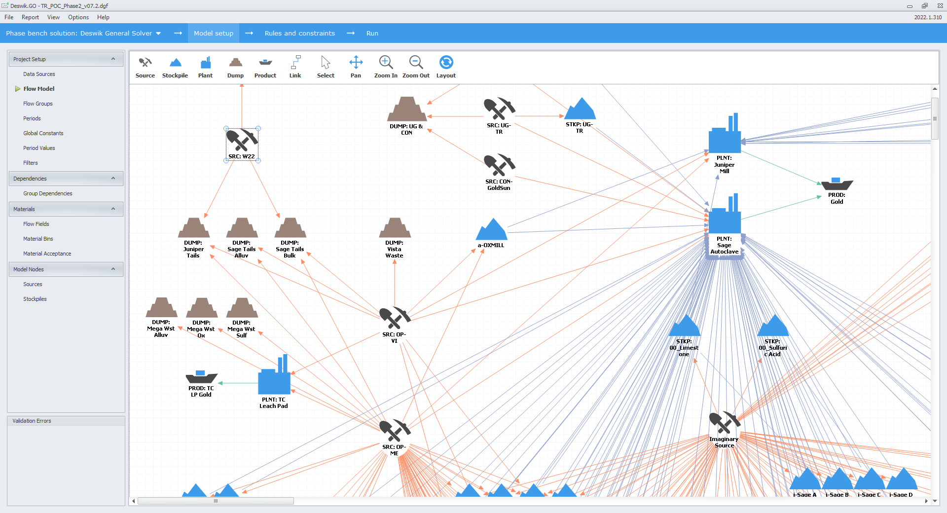
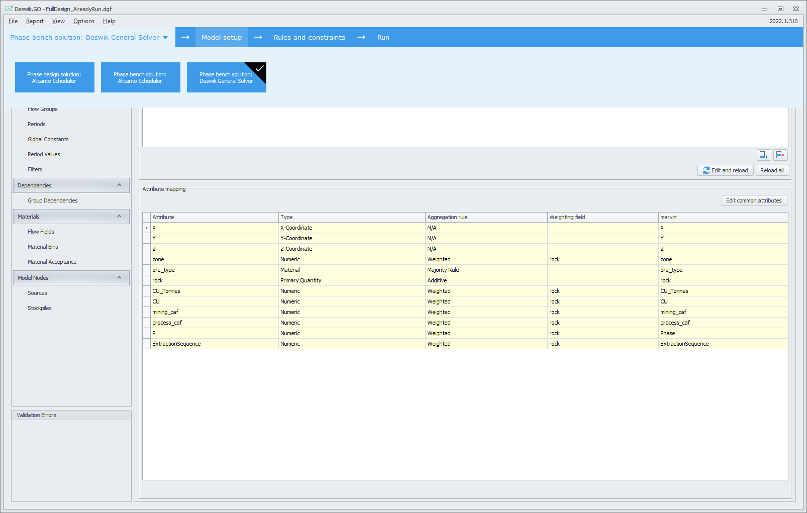
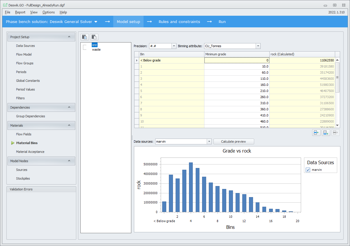
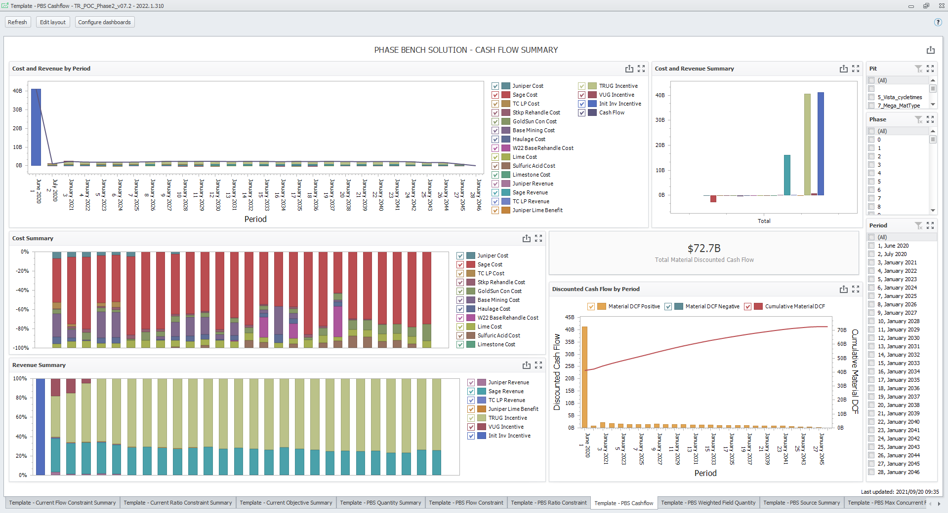
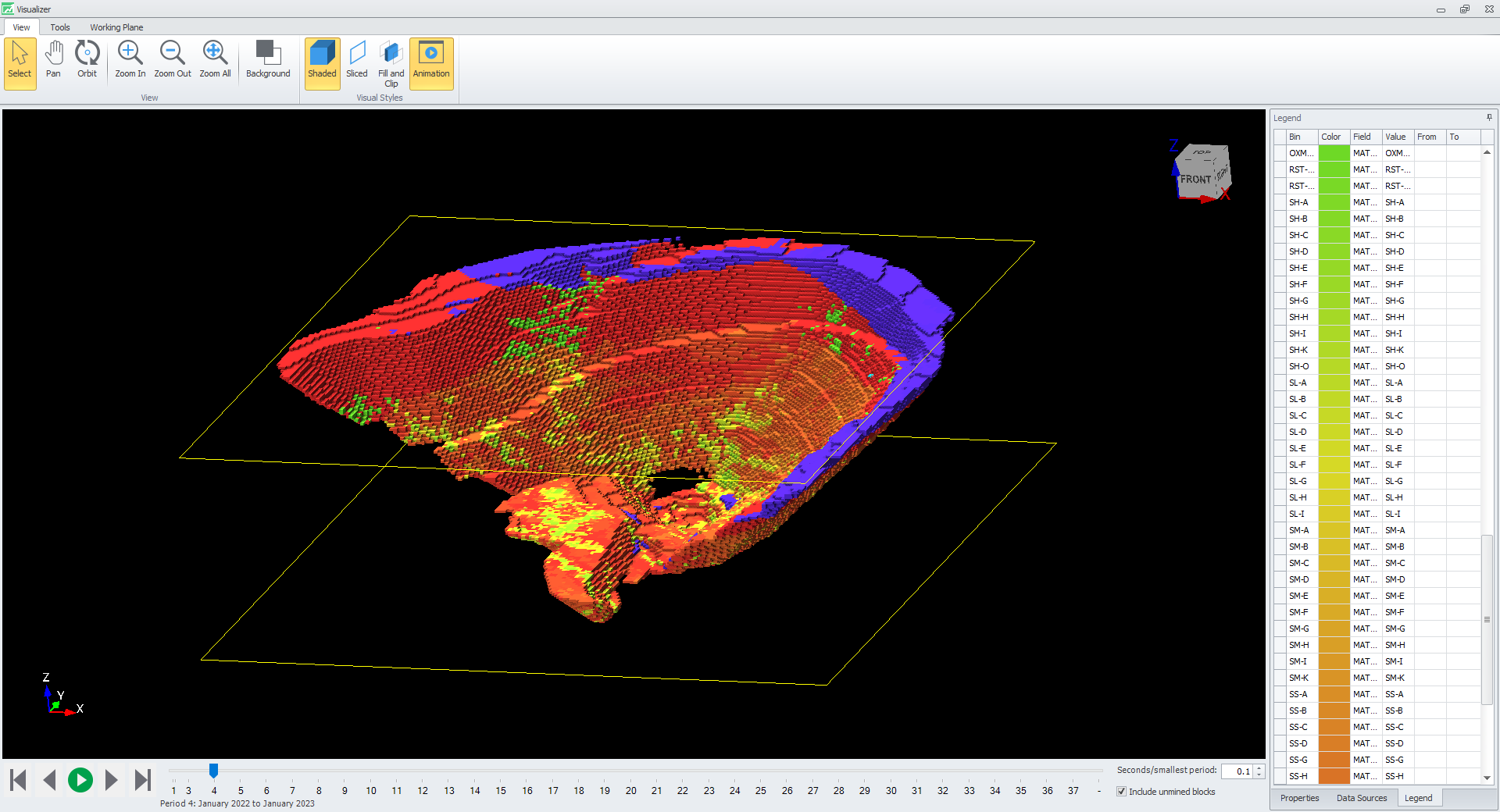
A new application was developed to house the workflow for making optimised strategic decisions across the mining chain. It needed:
- A clear and conscise guided workflow
- To support multiple solution calculation strategies
- To provide visualisations of the results, both via animations and dashboards
Surf Life Saving Foundation
UX Accelerator Project
As part of my UX Accelerator course with PeakXD, a Brisbane-based UX company, I completed project work for the Surf Life Saving Foundation to provide suggestions for improvements to their existing site to drive more donations. These donations are used to fund life saving services across Australia.
The project spanned 3 months and required the completion of all aspects of the UX process, from initial meetings with the project sponsor through to usability testing of delivered wireframes with real world participants.
Here are some of the artifacts I created over the course of the project.
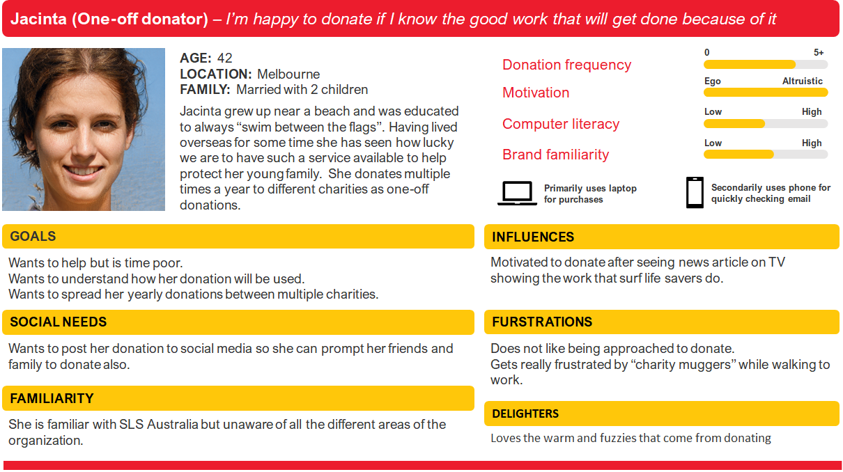
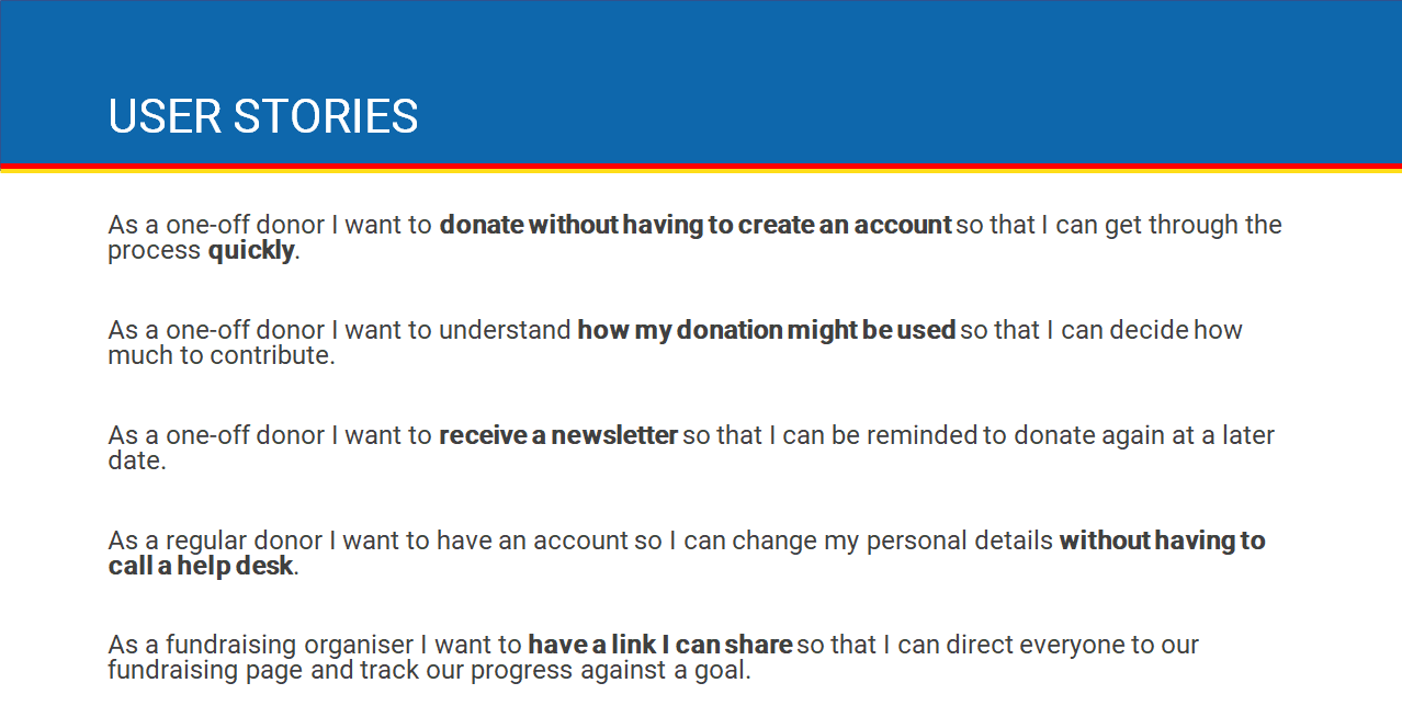
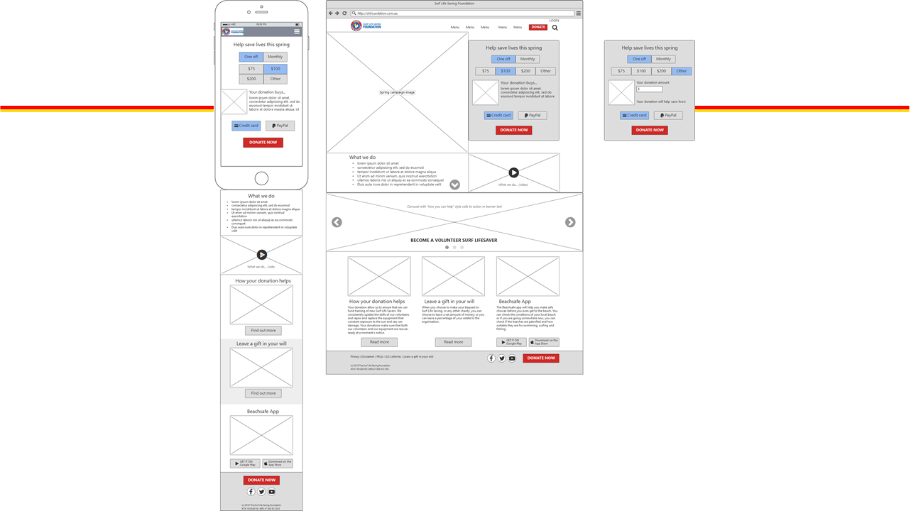
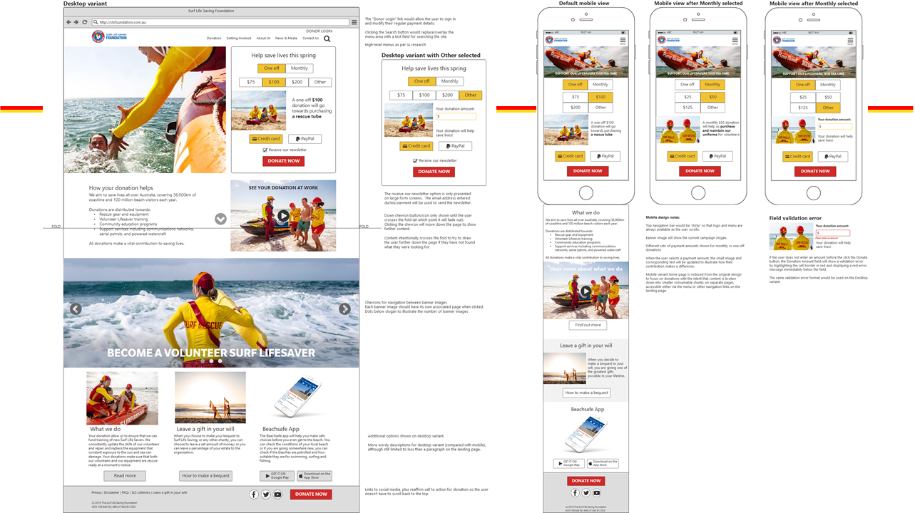
Or if you'd prefer to hear me speak about the project, check out the video I submitted at the end of the project...
Megaport
Software Engineer
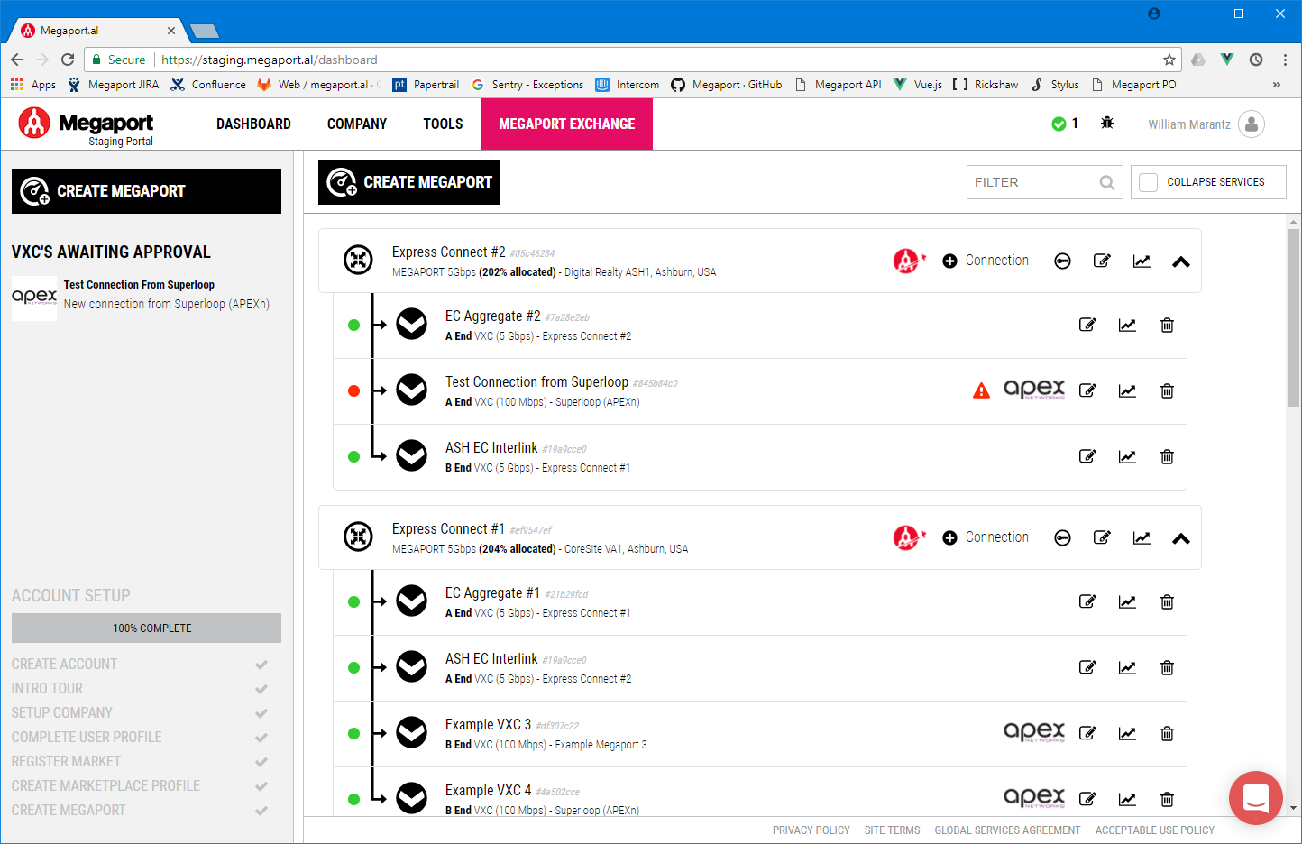
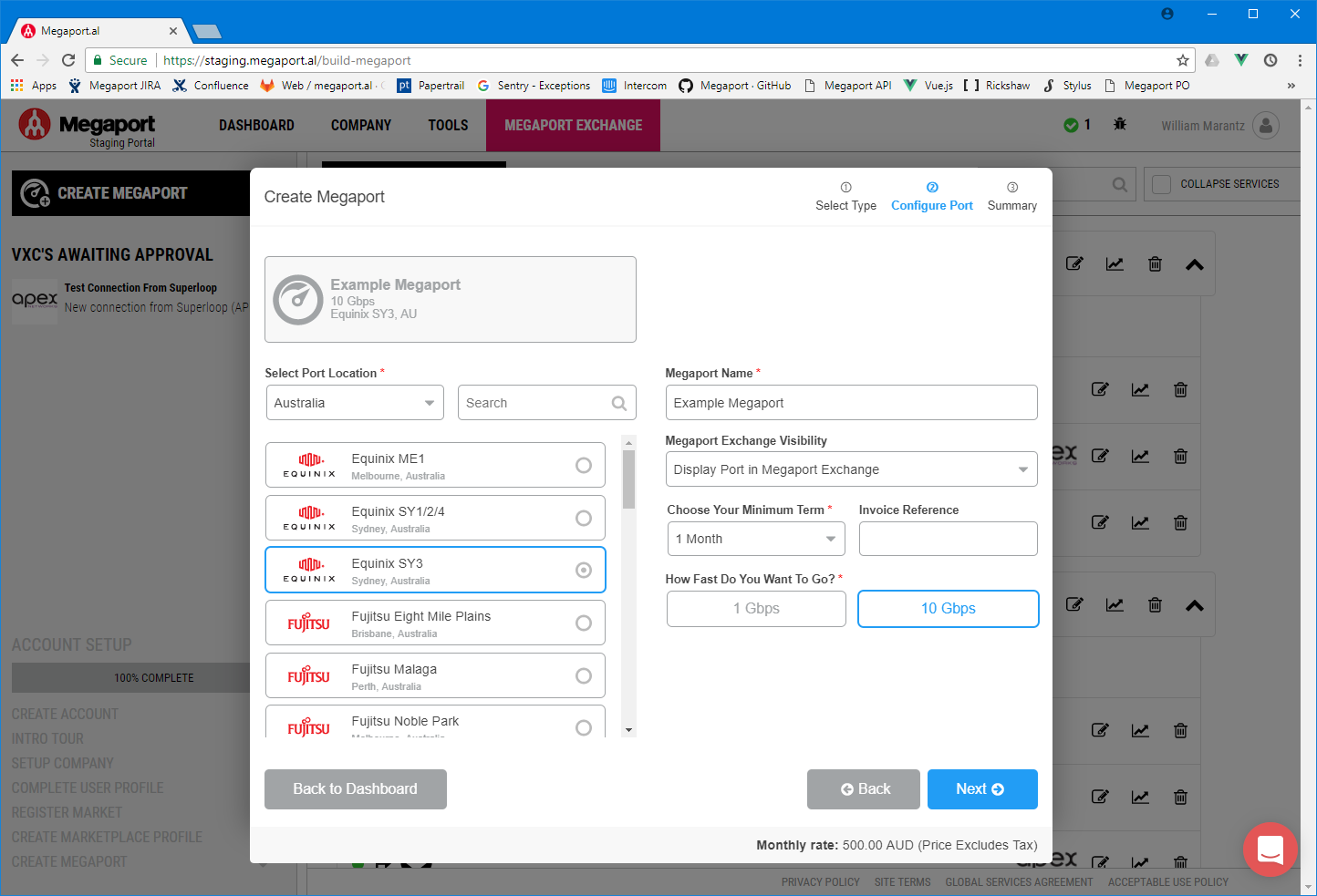
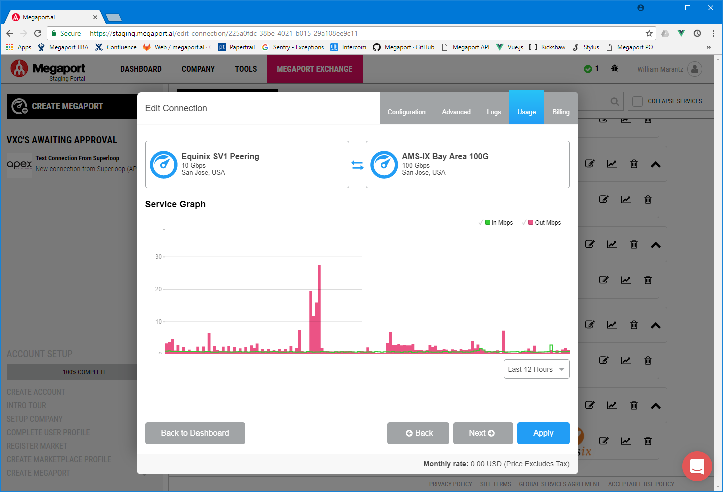
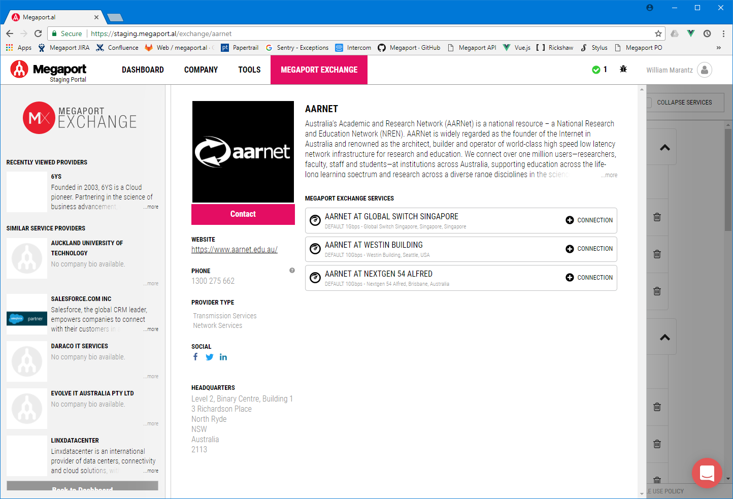
As a software engineer at Megaport I was responsible for implementing the client portal UI (Note: in this role I was not involved in visual design). The client portal is used to provide rapid configuration of network connections and network monitoring facilities. Here are some screenshots of my development work which were implemented according to the company's visual style.
Caterpillar
UI/UX Specialist
During my time at Caterpillar, I wore many hats including User Interface Team Lead, UI/UX Specialist, and Senior Software Engineer. I had the privilege to work on many 'next generation' products.
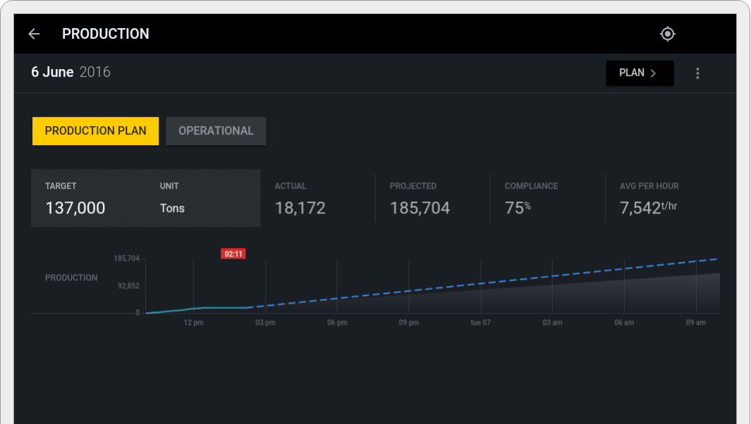
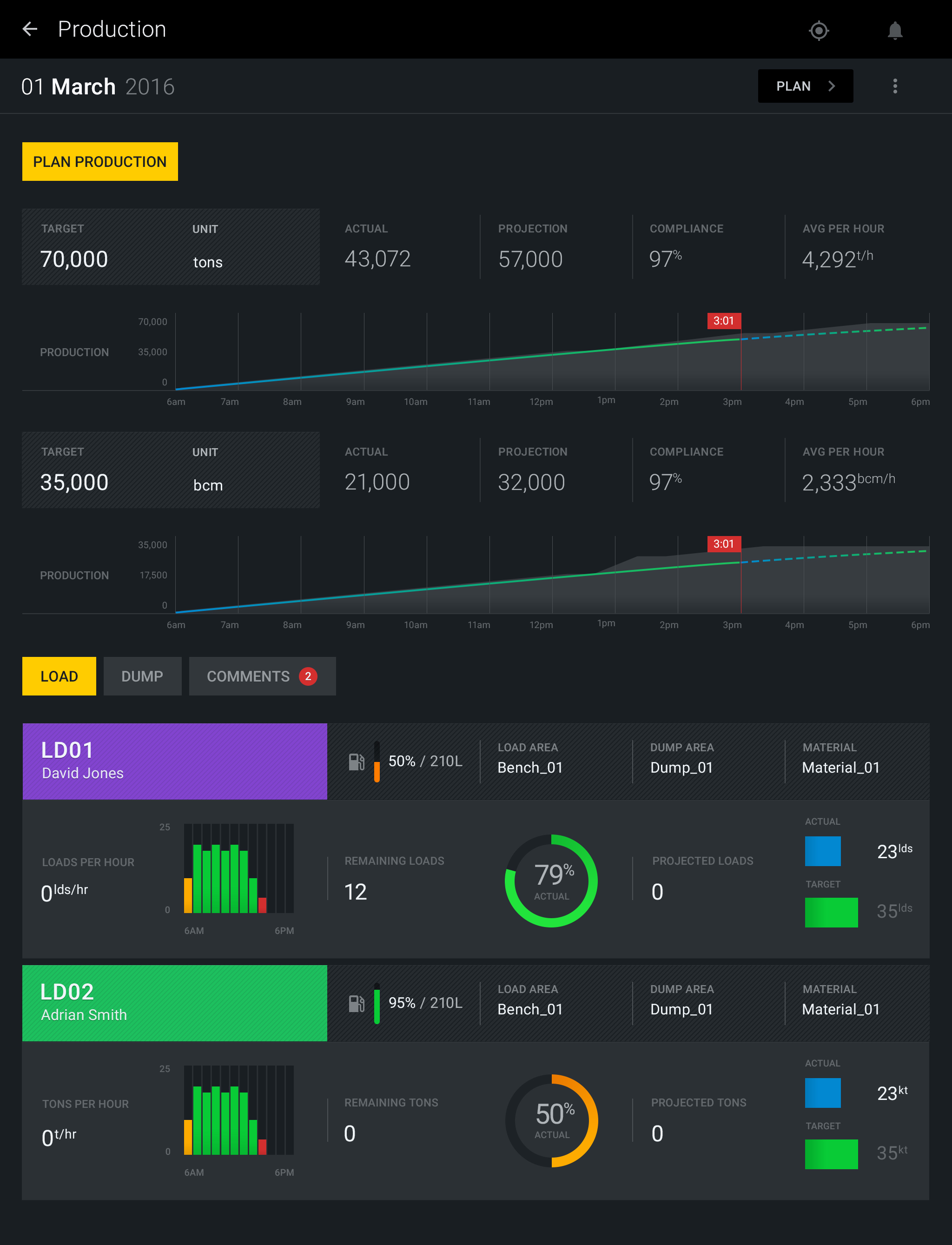
I was heavily involved in designing and/or implementing the screens below, to pixel perfect implementations. Focuing on getting the workflow 'right' and providing tools which were useful to the on-site operators was key to the success of these products.
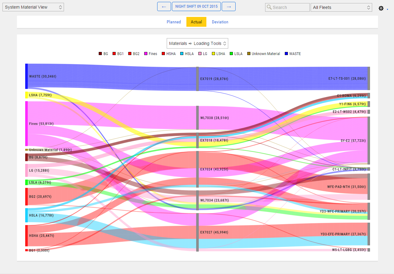
In the first image, the sankey diagram interactively illustrates material flows at a mine site. The design allowed individual truck loads of material to be monitored showing where the material came from, where it was taken, and how much. Additionally, it allowed them to see planned vs actual volumes to track their progress. Upon demonstrating this tool to a customer using their live data, they immediately picked up the phone and started cursing someone working on site for doing things wrong as it clearly showed valuable material being dumped in the wrong place, which they'd never previously been able to track.
The subsequent images were all designed for management teams to use on tablet devices for remotely planning and monitoring shift progress.
Boeing
Senior Software Engineer
I'm sorry, but there's nothing I can show you from my years at Boeing. As all my work was for the military it's all secret squirrel. I'd be happy to talk through the processes I followed and what it was like to work for the company though.
Contact
If you'd like to get in touch to find out more, send me an email. I'm always online but rarely on my phone